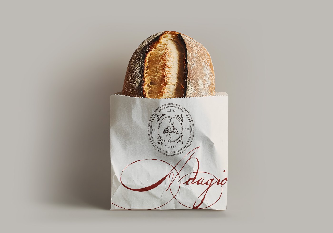
Objective
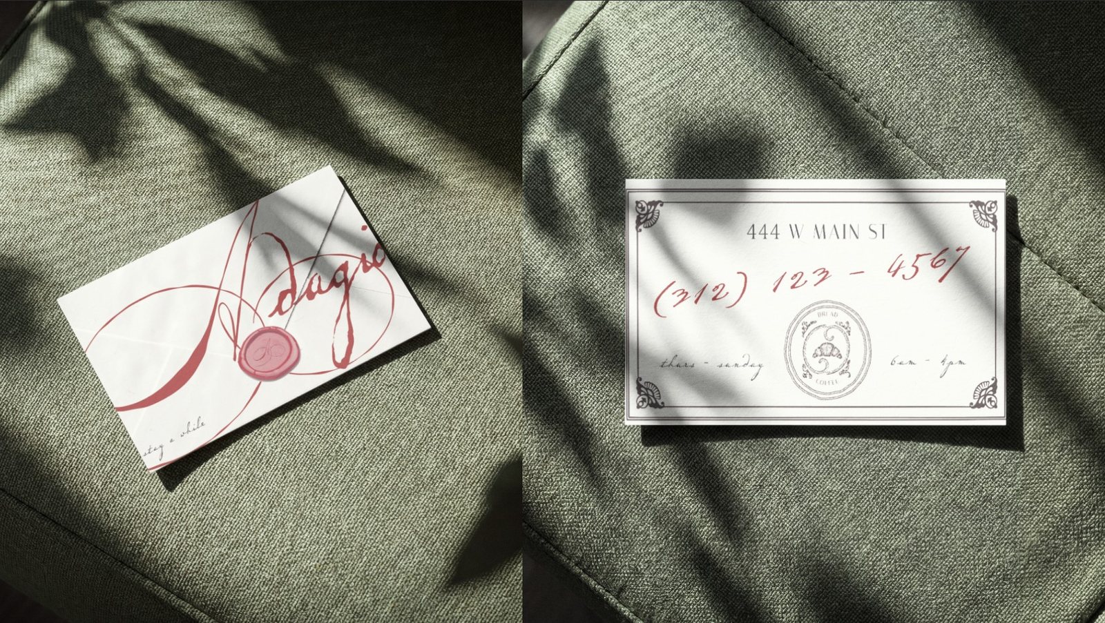
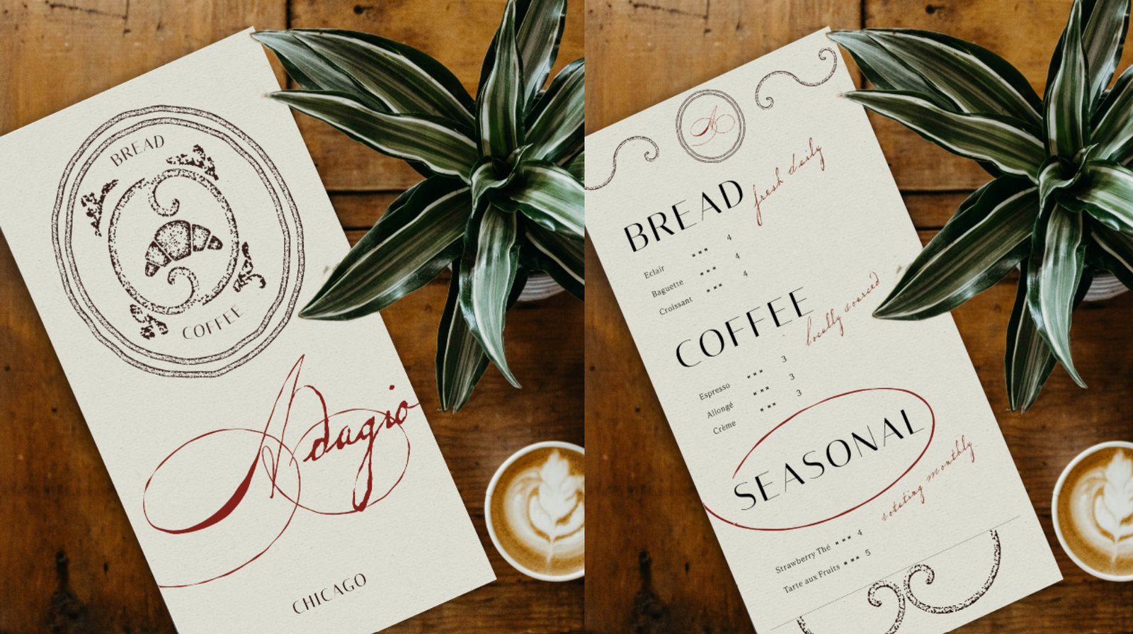
The brief outlined a complete, custom brand identity for Adagio, a Parisian style coffeehouse and bakery in Chicago. The deliverable was a cohesive visual identity system including a responsive logo suite, a custom color palette, a typography system, and a full set of brand guidelines compiled into a brand strategy document, plus supporting collateral like a menu and business card.
A business’s brand identity is what helps build trust, connections, and recognition in their community. A strong identity can help a business differentiate amongst competitors, and for a cafe in a busy city with plenty of other options just around the corner, Adagio needed a look and voice that displays their values and helps them stand out.
Synopsis
As a barista, I’m overwhelmed with a need for speed and efficiency that made me lose my love for the art of coffee & connections. I craved a space that valued craftsmanship and created a comfortable space for a community to share and connect with each other. The Adagio name comes from the music tempo for “at a slow pace.” I first heard it in ballet, where I grew passionate about learning the technique it took to move slow and controlled, it felt like the ultimate display of grace & mastery.
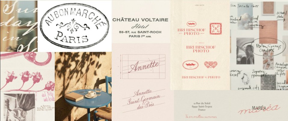
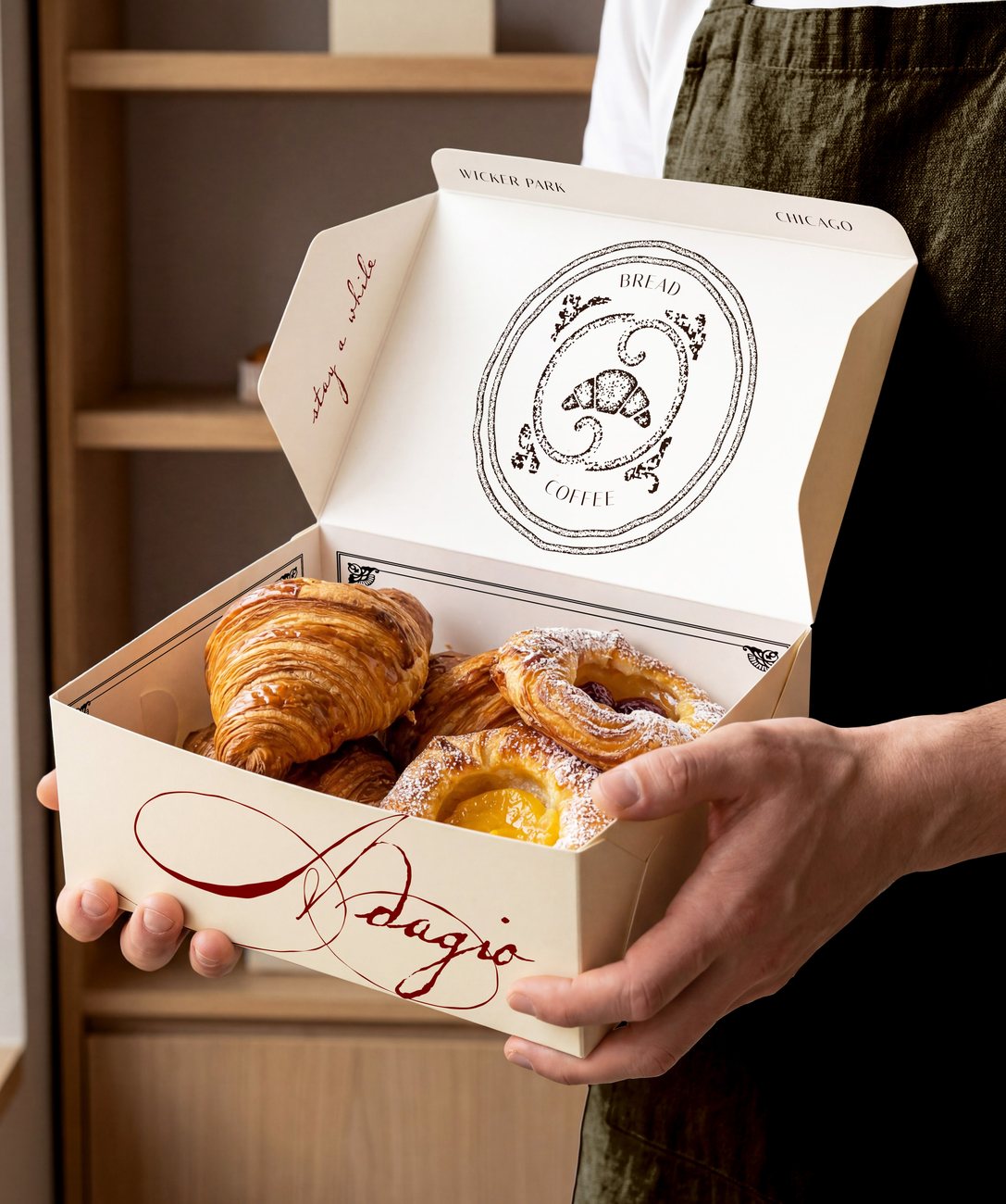
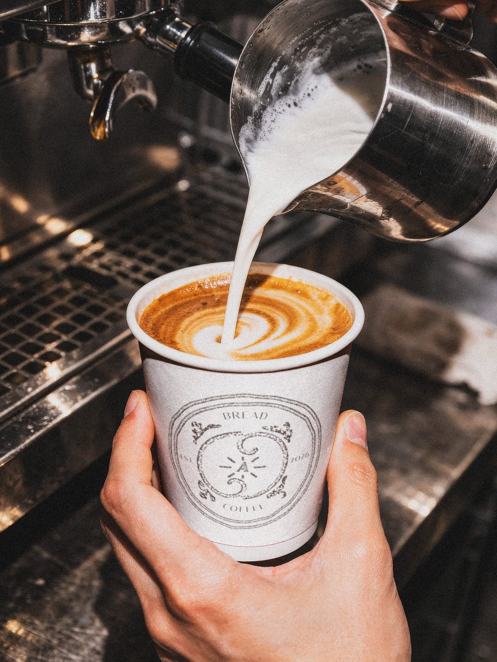
I drew inspiration from three main areas: Parisian cafe culture, classic french design, and patience & craft. I admired the slow pace of an afternoon on a patio in a Parisian neighborhood, I loved the idea of sitting for hours over an espresso and a newspaper. I tied in French inspiration with design elements like delicate flourishes and ornamental crests with soft curvature. I used elegant serif fonts paired with a calm, neutral color palette. I placed emphasis on craft by including stamped effects, wax seals, and other handmade touches. The calligraphic, handwritten accent typography signals care, effort, and patience.


Process
My process went as follows: Brainstorm, Identify, Define, Ideate, Prototype, Test, Refine, Implement. After deciding on my concept, I built a sample sheet of color swatches, type, and logos as a reference to use throughout the process. Then, I began sketching out ideas for logos and layouts for the menu and business card on paper. I made digital renditions of the logos and ended up narrowing down my ideas to a horizontal wordmark, a vertical crest, and a favicon.
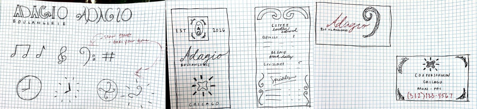

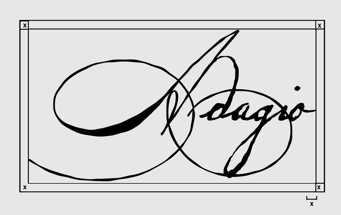
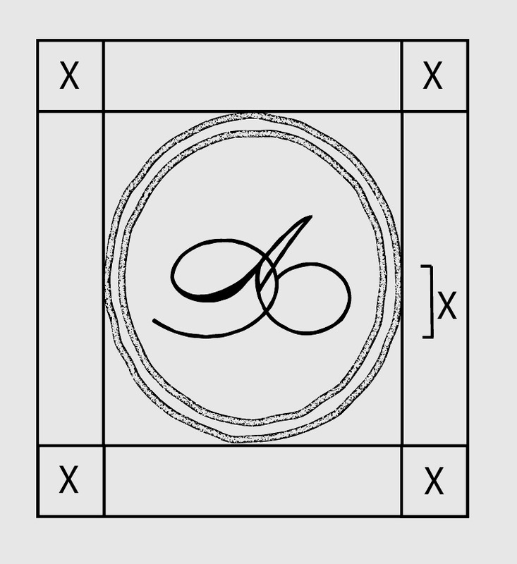
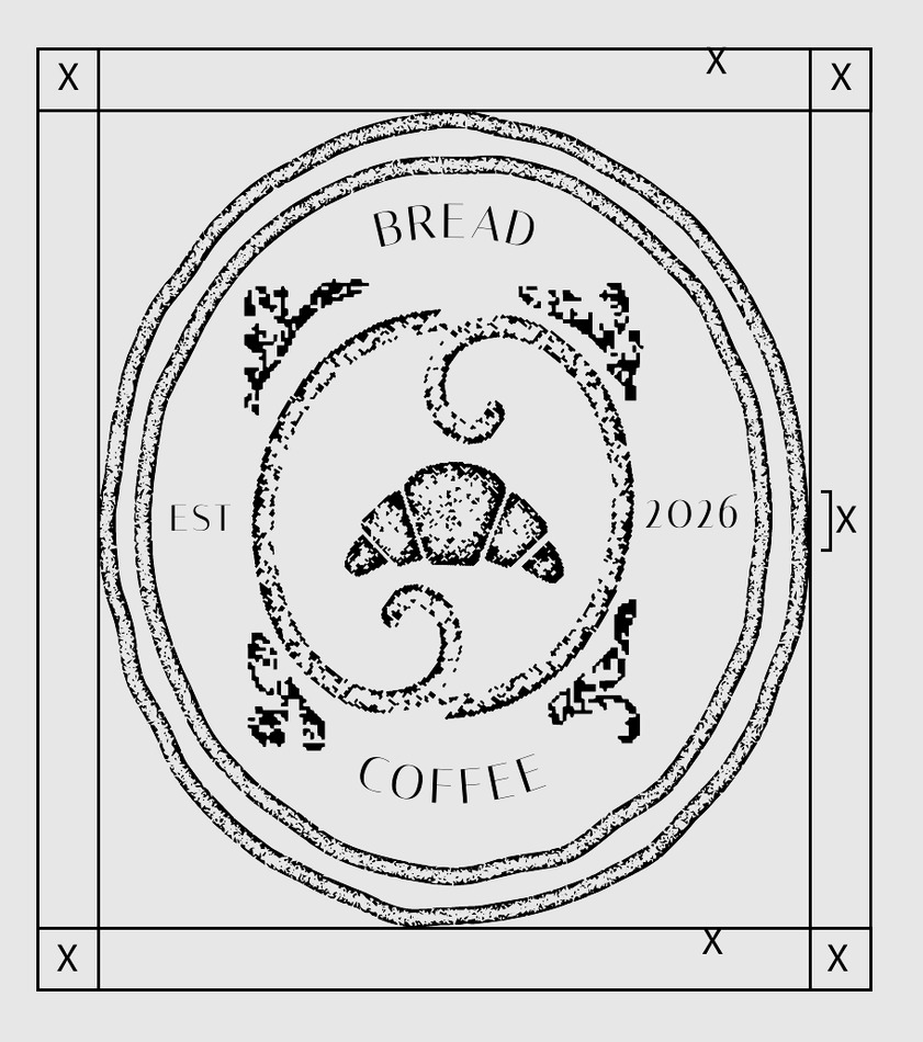
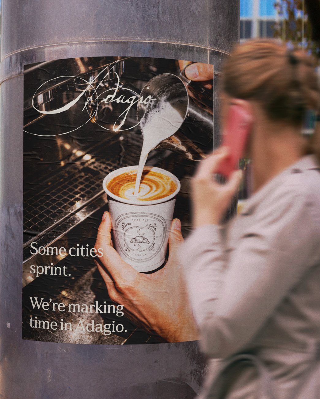
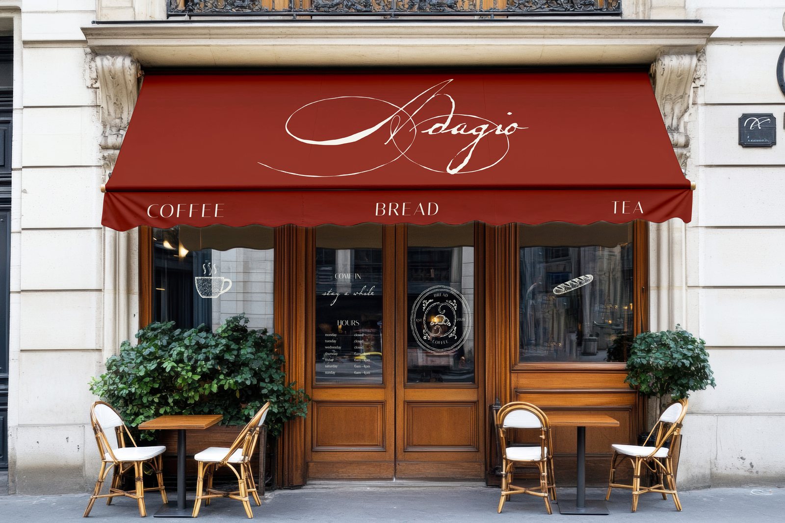
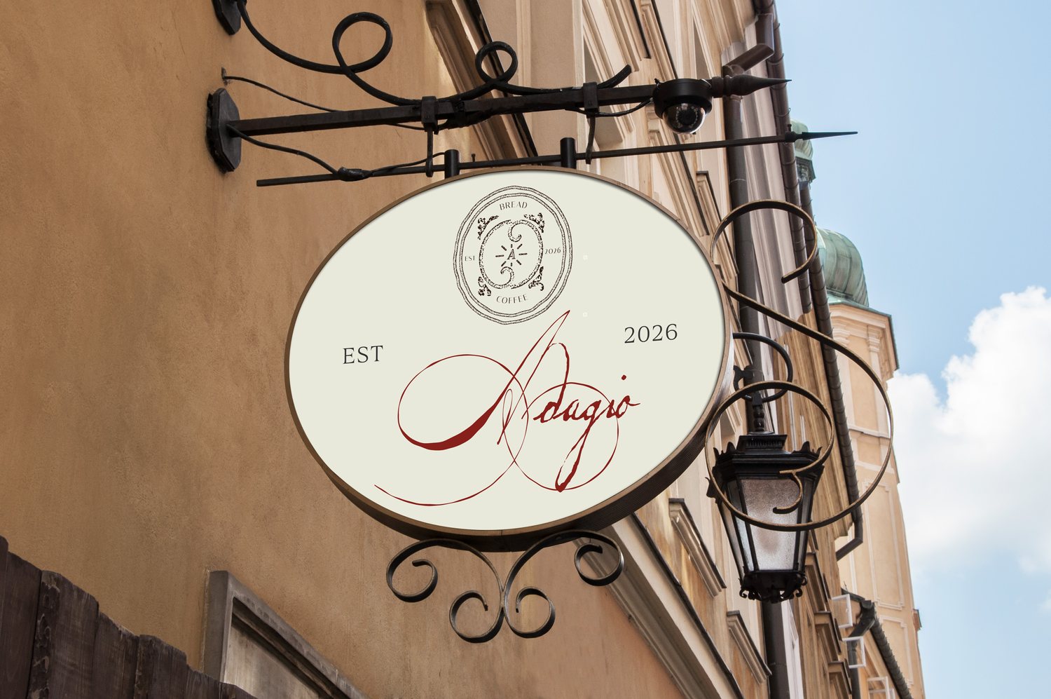
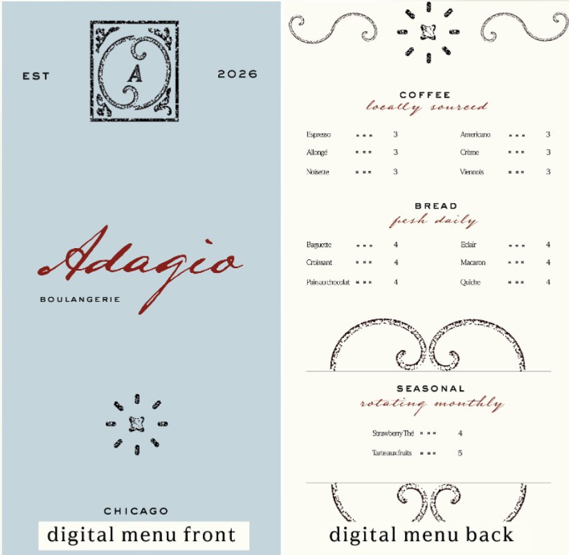
I started the prototyping process with the menu. I figured that at its large scale I could see how every brand element was working together. With the business card, I was able to test how the the logo and type held up at smaller scale. I built mockups of each piece to verify their cohesion and integration into a real life setting. With these prototypes, I was able to present to my peers and receive feedback that helped me further improve my project.
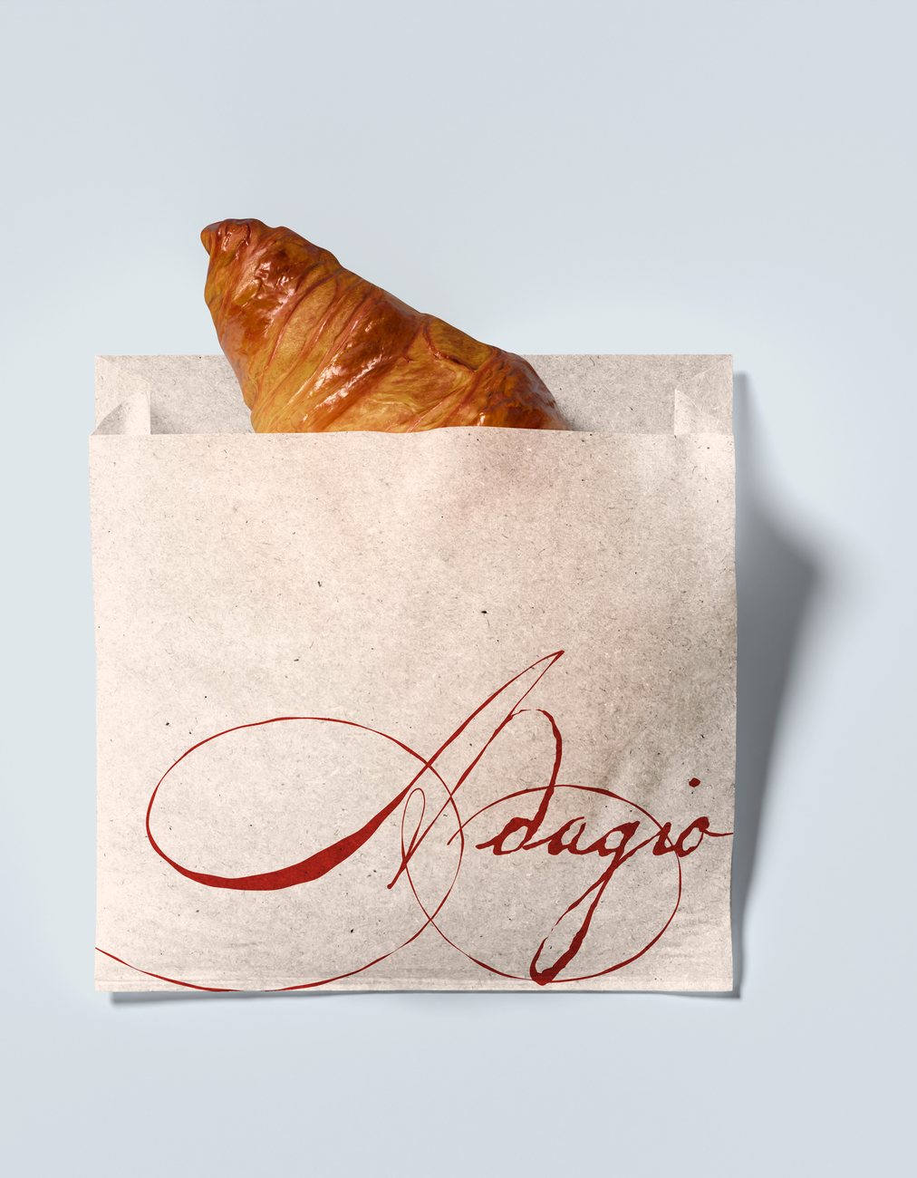
I went through many rounds of iteration and refinements. The main changes I made involved reworking the logos so they read more as a family, refining font pairings, and softening the curves of the crest so the whole design read as a cohesive system with the same inspiration. Throughout the project, I managed a tight timeline by blocking off windows to dedicate time, while breaking the project into small tasks to fight task paralysis and perfectionism. The result was a complete brand identity, meeting each of the deliverables outlined in the brief. I created a responsive logo system, custom color palette & typography made up of 3 fonts with defined hierarchy, accompanied by a brand guidelines document that covers mission, values, brand voice, and more.
Results