Objective
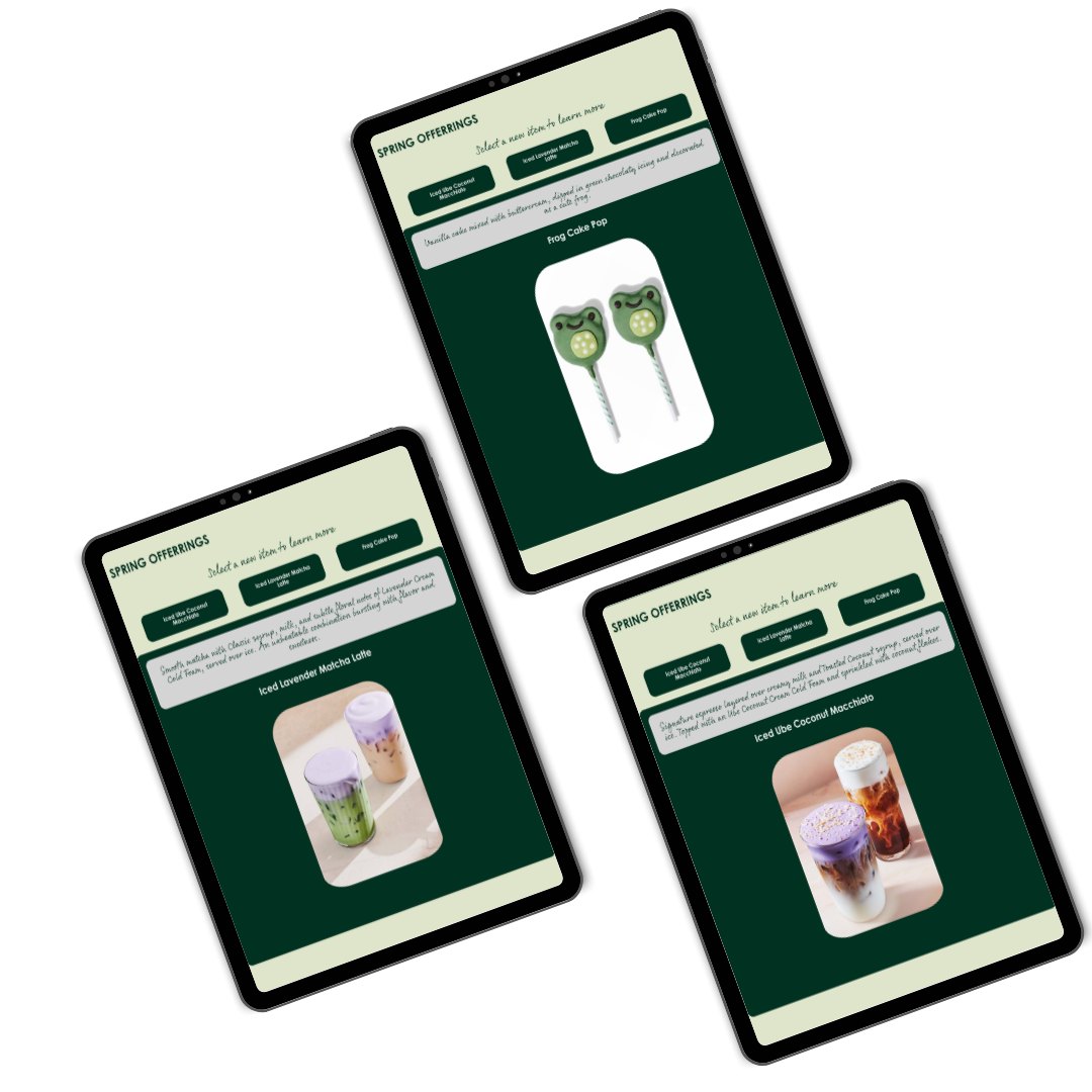
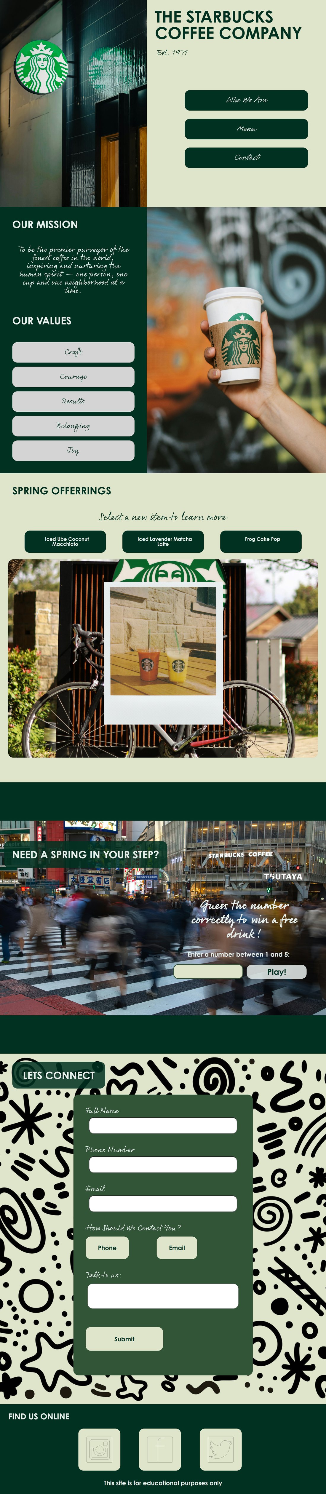
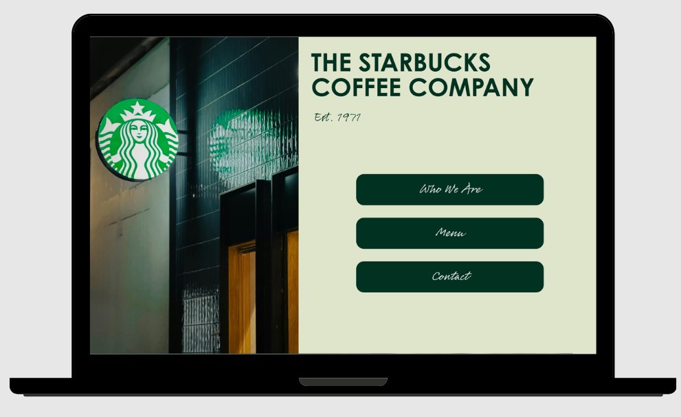
The purpose of this project was to create a single page website for Starbucks using HTML, CSS, and JavaScript. The site was to be fixed at 1280px and feature multiple specific JavaScript components: a product display section that allows the user to control and view one available product at a time; a gameplay section that allows the user to input a number to be compared to a randomly generated number, where a message displays whether or not the numbers match; and a form that validates input upon submit using regex and event handlers, preventing submission and notifying the user of any missed required field on invalid input, and creating a JS object to display the user’s information on valid input. Based on these requirements, I was inspired to create a spring promotional website following Starbucks’ current brand identity and products. The purpose of this site is to display and inform customers of the new spring items on Starbucks’ menu. It serves customers as it provides product information, brand interaction, and a mode of communication with the company.
Synopsis
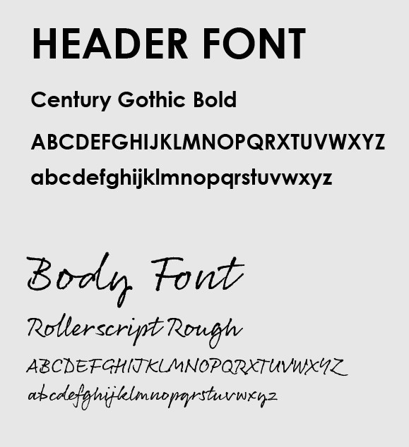
The work maintains Starbucks’ actual brand identity. I wanted to lean into the new “Back to Starbucks” initiative, which features a more handcrafted, welcoming, and comfortable atmosphere while still offering a sleek and elevated brand experience. That initiative was my main inspiration. I created a color palette based on Starbucks’ iconic green, and used a font similar to their bold, all caps style for the headers. As for the body font, I went with a handwritten style that drove home the “Back to Starbucks” feel. I also used images from Starbucks’ actual spring promotional update, specifically for the product display section, instead of stock images, so that while flipping through items everything seemed cohesive and realistic to the brand. I used content from that spring promotional update for the product descriptions.
Process
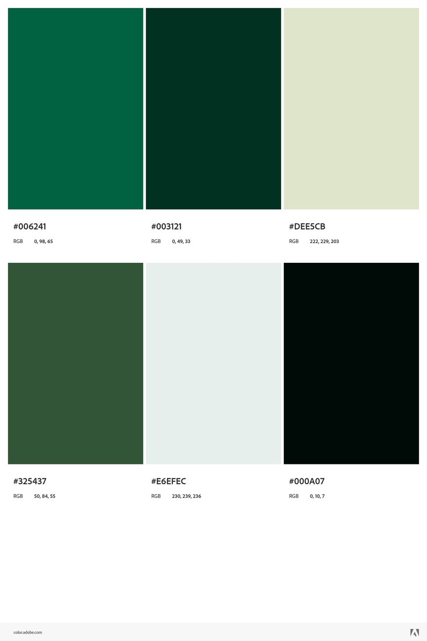
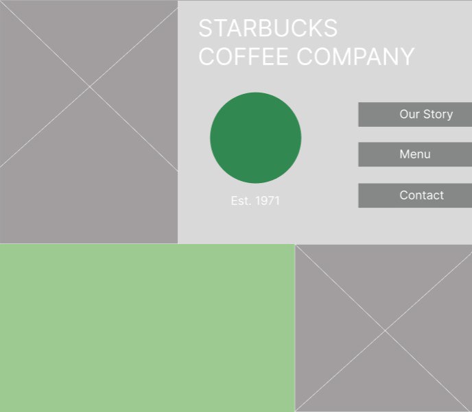
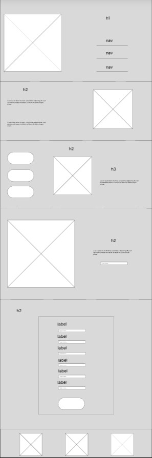
I like to begin my design process with a clear understanding of the colors and fonts I will use. This helps me get an idea of how information will be displayed on the page, and where I will use color, images, and patterns throughout when I begin wireframing. Once I had a solid wireframe, I created a high fidelity mockup of the main landing page to ease into the content search. I like to choose one intention first and build everything from there, because it makes the blank canvas less daunting when I have something fixed in my head.
I like to stay organized so I always create a folder for image assets so I can gather as many as I’d like and test out different options as I go. Both the wireframe and high fidelity mockups were created using Figma.
I always code in increments, comparing the structure of my wireframe to the status of my page in the browser so I can be sure everything is showing up the way I intend. This was the routine I followed throughout every section: write the HTML, test and check DevTools as I go, then figure out my JavaScript. Once I had most of the functionality figured out, I began styling with CSS. Since I had fonts and colors picked out already, I added them to the root of my CSS document for easy access and switching when necessary.
Results