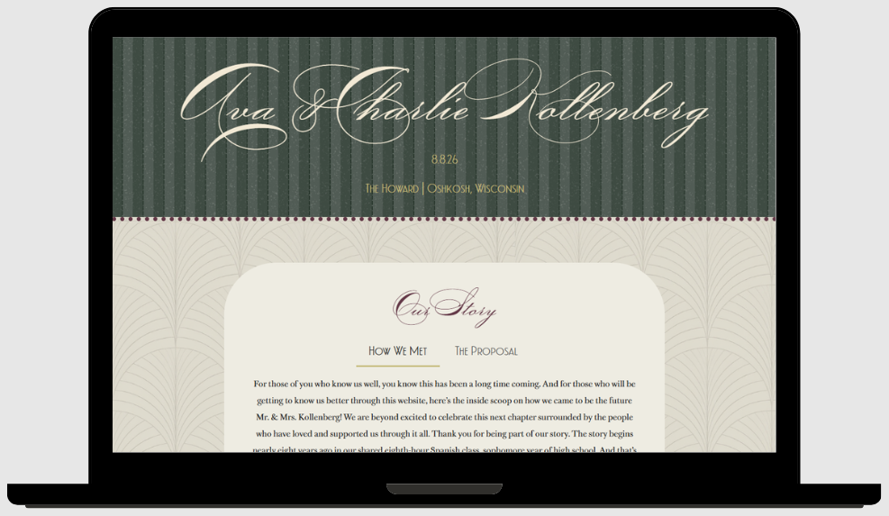
Objective
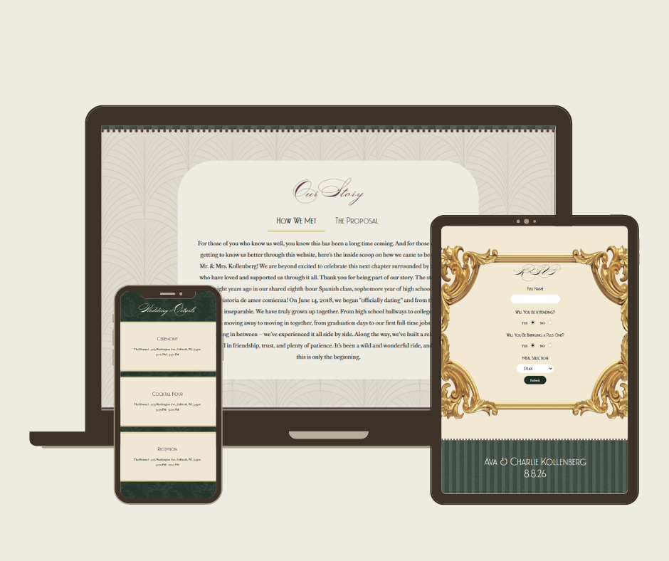
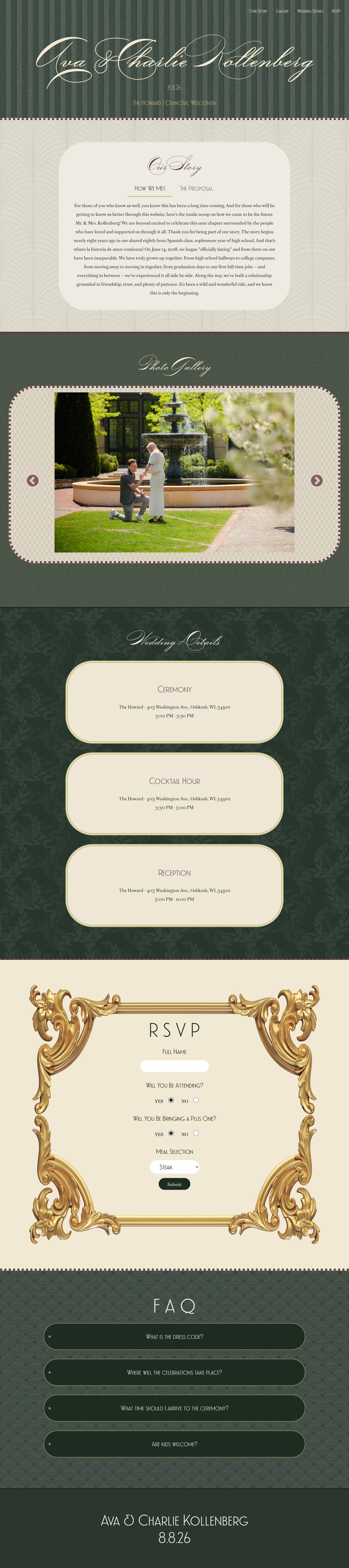
The purpose of this project was to create a single page website using HTML, CSS, and JavaScript. The site was to be fixed at 1280px and feature four specific JavaScript elements: a jQuery widget/plugin, Ajax/API, web storage, and a slideshow/carousel. The work was inspired by my best friend’s recent engagement and my role as a bridesmaid. I wanted to create a platform for them that would help ease the planning process, acting as a tool for communication and convenience. For the couple, it serves as both a communication tool and a planning resource, helping them stay organized throughout the process. For the guests, it’s an easily accessible landing place to learn about the newlyweds, get all the details they need, and feel a sense of connection and excitement before their big day.
Synopsis
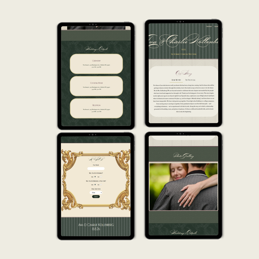
The work references the bride’s vision directly. I gathered ideas from her invitations and the Pinterest board she used when planning her wedding, which ultimately became my inspiration too. I also noticed that the bride had saved a lot of photos that mixed patterns and textures, and decided to use this as a basis for my design. I ended up using a combination of pattern mixing and texture layering as backgrounds for the site that communicated the same feeling I got from seeing her inspiration board.
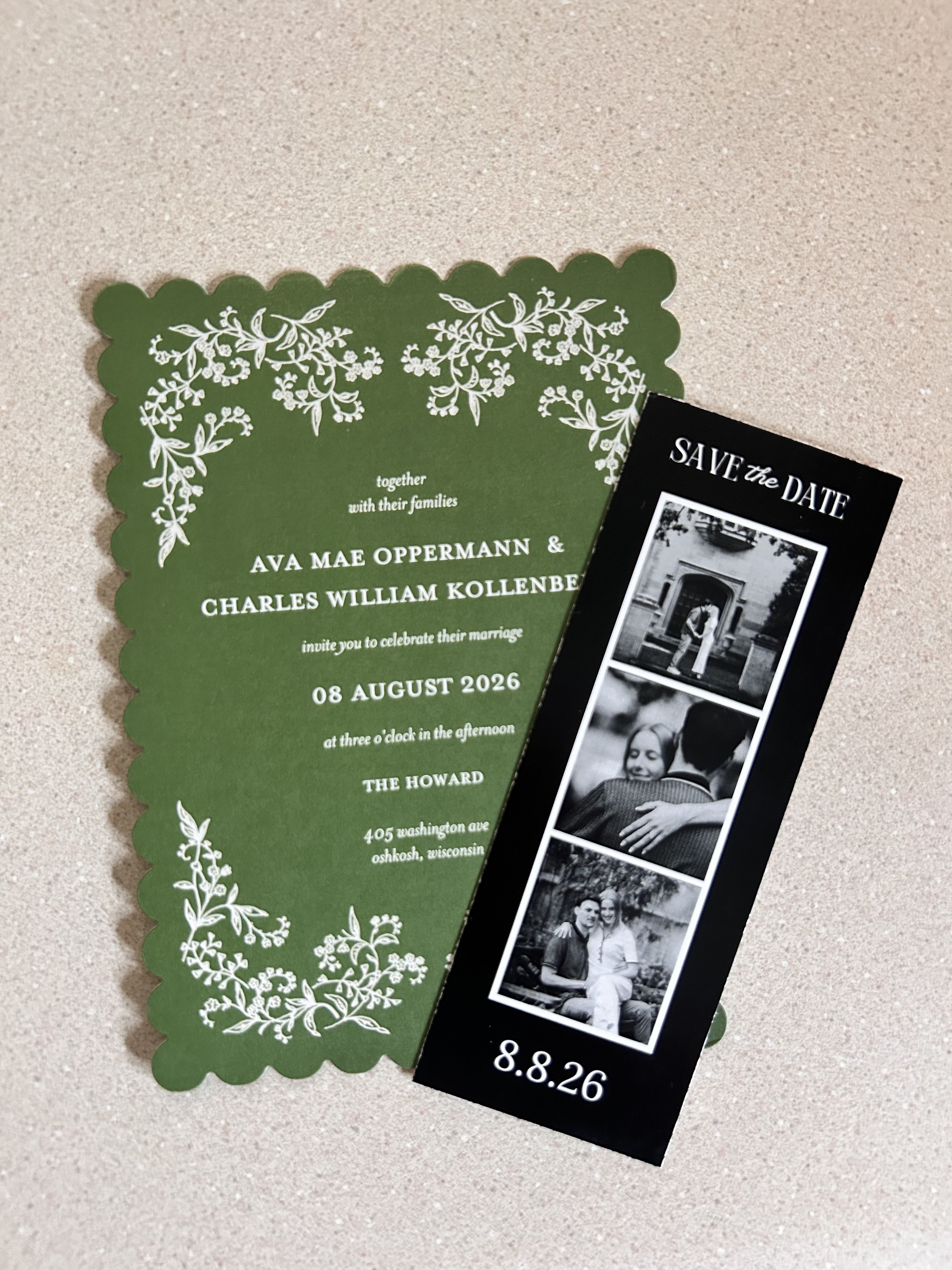
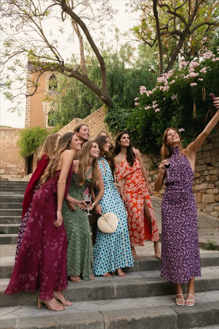
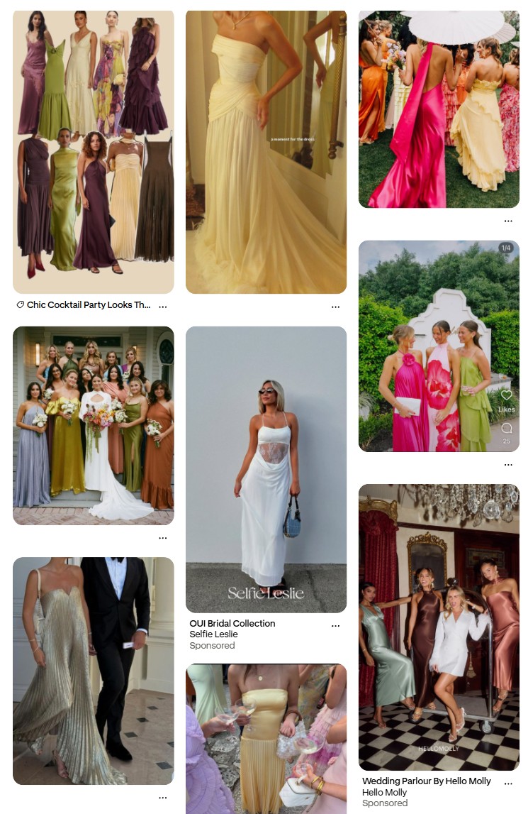
She had a very classic, elegant style with a modern twist that I tried to replicate in my design, starting with the fonts. I chose an approachable, easy to read body font, and paired it with a header font that leaned into a 1920’s-esque vibe. I also added an accent font that was a classic calligraphic wedding style to bring everything together. I created a color palette based on the colors I saw consistently throughout her board, which ranged from greens to plums and yellow golds, then chose a few of my own lighter colors to complement hers.



Process
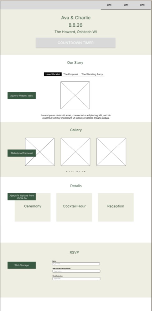
During the wireframe process, I was able to decide what content I wanted on my site, and how I would apply each required widget or function to my particular content. I was able to set up an outline for both the look and structure of my page and its main functions simultaneously. When it’s time to start coding, I always begin by outlining the structure of my site with comments. This helps me streamline the process so I know which section the styles below correspond to. I also use comments to explain the functionality of my code in plain language, which helps me and anyone else reading the file understand the logic and the purpose behind it.